Reading a Colour Palette: Inside the Mr. Rafiei Home Interior
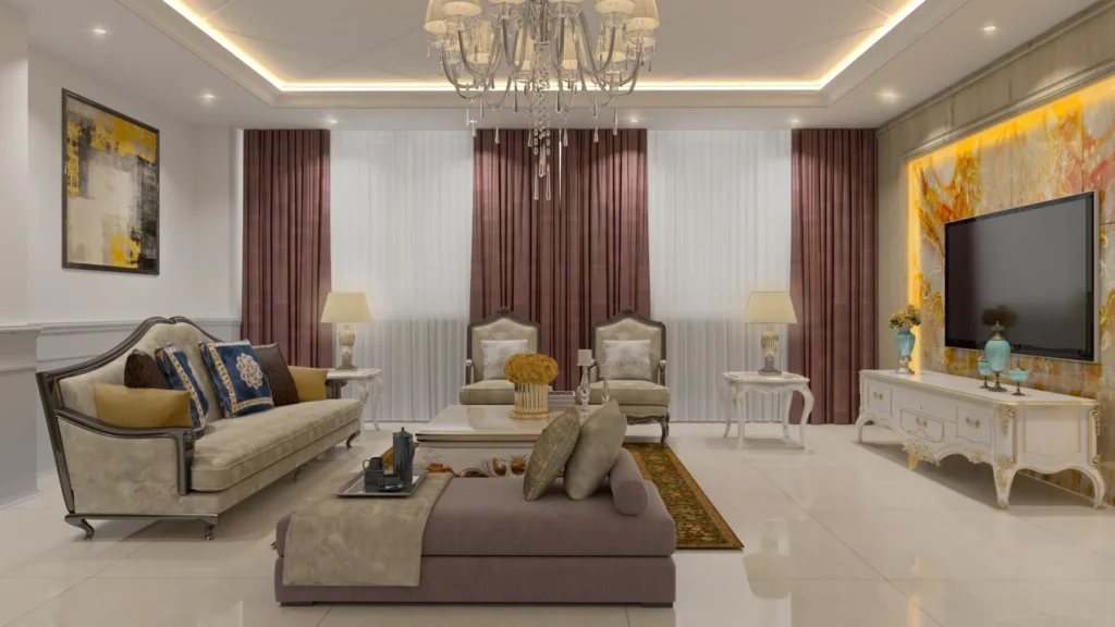
Colour palettes are easier to understand when you see how much of each colour a room really contains. For the Mr. Rafiei Home project in Toronto, a classic luxury residential interior from 2020, we extracted the four dominant tones from the final renders. Here is what they are and why the room feels the way it does.
The four dominant tones
Warm greige #9d907e 41% · Taupe-brown #796b59 24% · Pale sand #c3b8a9 19% · Dark brown #503d33 16%
- Warm greige, #9d907e (about 41%). The largest share, and a calm, light base for the whole interior.
- Taupe-brown, #796b59 (about 24%). A deeper mid-tone that adds weight and warmth.
- Pale sand, #c3b8a9 (about 19%). The lightest of the four, a soft highlight.
- Dark brown, #503d33 (about 16%). The smallest share, but important: it creates depth and contrast.
All four sit close together on the warm side of the colour wheel. The renders show tones such as these across the classic panelling, the light timber raised-panel kitchen cabinets with gold handles and the veined stone worktops. That is why the interior feels cohesive even with a lot of decoration.
Accents that are not in the palette
The plum velvet furniture with gilded frames and the burgundy curtains occupy a small area, so they hardly appear in the numbers. But they are what people remember. A good palette often works this way: a quiet base of three or four tones, and a few strong accents in small amounts.
Light changes colour
Crystal chandeliers, cove lighting and a backlit onyx-style TV wall shift the same beige from cool to golden depending on the view. When you choose a palette, look at it in the lighting you will actually have, in the evening as well as during the day. A 3D preview is a useful way to test this before anything is bought.
How to use this idea in your own space
- Pick one dominant light tone for walls and large surfaces.
- Choose a mid-tone for timber and furniture, and a dark tone for contrast in small doses.
- Add one or two accents in a stronger colour, in textiles, art or a single piece of furniture.
- Check the combination under warm and cool light, and next to your floor.
Explore more
You can see the full set of renders in the Mr. Rafiei Home project. If you are choosing colours for a home or office, tell us your style and we will help you build a palette and show it in a 3D preview. See also our interior design service.
Keep Reading
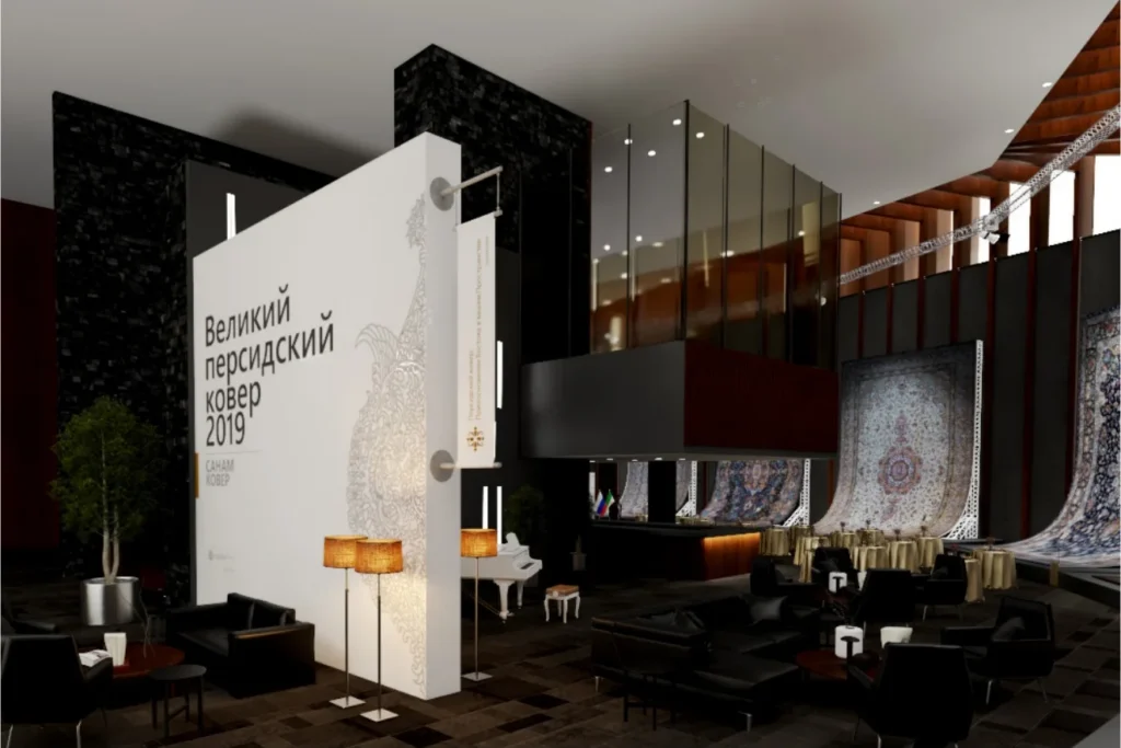
Hanging Persian Carpets in Moscow: Curved Space Frames, Zoning and Light
How Charisma Design and Karestan designed the Grand Persian Carpet Event in Moscow: curved display stands, three zones and projector lighting for monumental carpets.
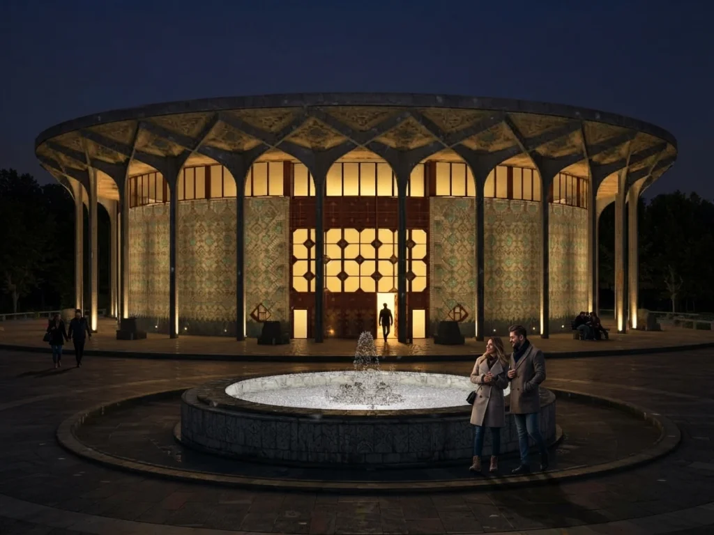
Rebuilding Tehran City Theatre in 3D: A Geo-Located Lighting Study
How an existing Tehran landmark was rebuilt in 3D from survey data and tile textures, then lit with day, rain and night scenarios set to its real coordinates.
Applied Aesthetics of the Persian Carpet in Contemporary Interior Design
A practical framework for reading the Persian carpet as a design element: centre and border, rhythm, balance, scale and a seven-step method for choosing and placing it in contemporary interiors.
LET’S DISCUSS YOUR PROJECT
Fill out the form and our manager will contact you for consultation.