Platinum Fereshteh Commercial Building: Interior Visualization Case Study
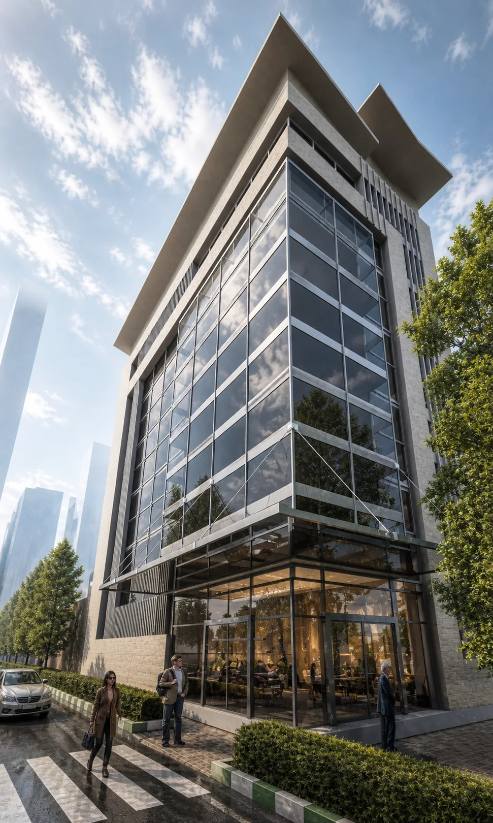
A commercial building on Fereshteh Street in Tehran has to do two jobs at once: look convincing from the pavement and work for very different tenants inside. In 2013 Charisma Space was asked to show what the Platinum Fereshteh Commercial Building could feel like from the inside, from the street-level retail frontage to the reception desks, open offices and meeting rooms on the upper floors.
This case study walks through that work: the building, how the visualization catalogue was organised, and the interior spaces we rendered. The building has since been built; the images on this page are computer-generated renders made during the design stage, not photographs of the finished building.
In short
- A nine-thousand-square-metre commercial and office building with four parking levels was presented through a 55-page visual catalogue.
- Every interior render is paired with a plan and a marked camera position, so a viewer always knows where they are standing.
- Office floors were shown in eight different layouts, plus a common corridor and a ground-floor foyer.
- A restrained palette of white surfaces, warm timber, glass and soft linear lighting ties the retail, reception and office spaces together.
Project at a glance
| Project | Platinum Fereshteh Commercial Building – interior and exterior visualization catalogue |
| Location | Fereshteh Street, Tehran, Iran |
| Year | 2013 |
| Client | Mr. Mohsen Vafaei and Mr. Majid Hossayni; contractor and client: M and M Group |
| Building | Site area about 1,300 m²; total built area about 9,000 m² including four parking levels (about 120 spaces) |
| Uses | About 1,000 m² of retail units and about 3,600 m² of offices in 28 units |
| Our scope (Charisma Space) | Interior design visualization and rendering, exterior day and night views, presentation catalogue |
The building and the brief
The building stands on a site of roughly 1,300 square metres and offers about 9,000 square metres of built area. Four levels are given over to parking, around 120 spaces, a vital requirement for a location where parking demand is high. Above that, the retail units are tall, with a height of about six metres, and the upper floors hold about 3,600 square metres of offices divided into 28 units.
The office plans were drawn so that each unit could be adapted internally to different kinds of business. Circulation is served by two passenger lift lines and a separate service lift. The visualization had to show all of this clearly to people who would be deciding whether a particular floor suited them.
A facade designed to be noticed
The exterior combines large dark glass surfaces with layers of perforated metal screens that wrap the upper retail and office levels. In daylight the screens read as a pale, textured skin against the glass; at night, with light from inside and slim linear fixtures on the upper floors, the same screens glow and the building becomes a lantern on the street. We rendered both conditions so the facade could be judged as a day-and-night composition rather than a single picture.
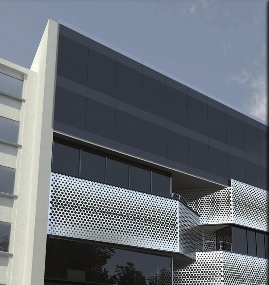
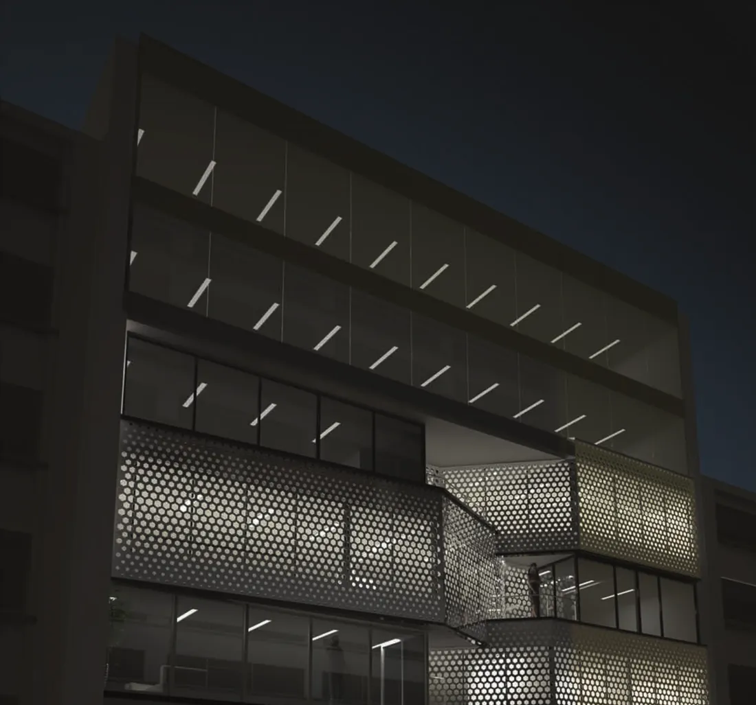
The original catalogue also shows the street-level retail frontage with illustrative tenant signage. Brand names and logos used in those scenes were for illustration only, so we have cropped them out of the images on this page.
How the catalogue is organised
A building with this many different interiors can easily become a blur of similar rooms. To avoid that, every page of the catalogue follows the same logic. The render sits on the left; on the right are a small floor plan with the camera position and view cone drawn on it, and a second plan of the whole floor that highlights the unit shown. A caption gives the floor, the orientation of the unit, its approximate area and the number of rooms.
The sections run in a fixed order: an overview of the building, the ground-floor retail units, the foyer, then eight office types, and finally the shared corridor. Anyone leafing through the catalogue can move from the general to the specific and always knows which part of the building they are looking at.
Reception areas
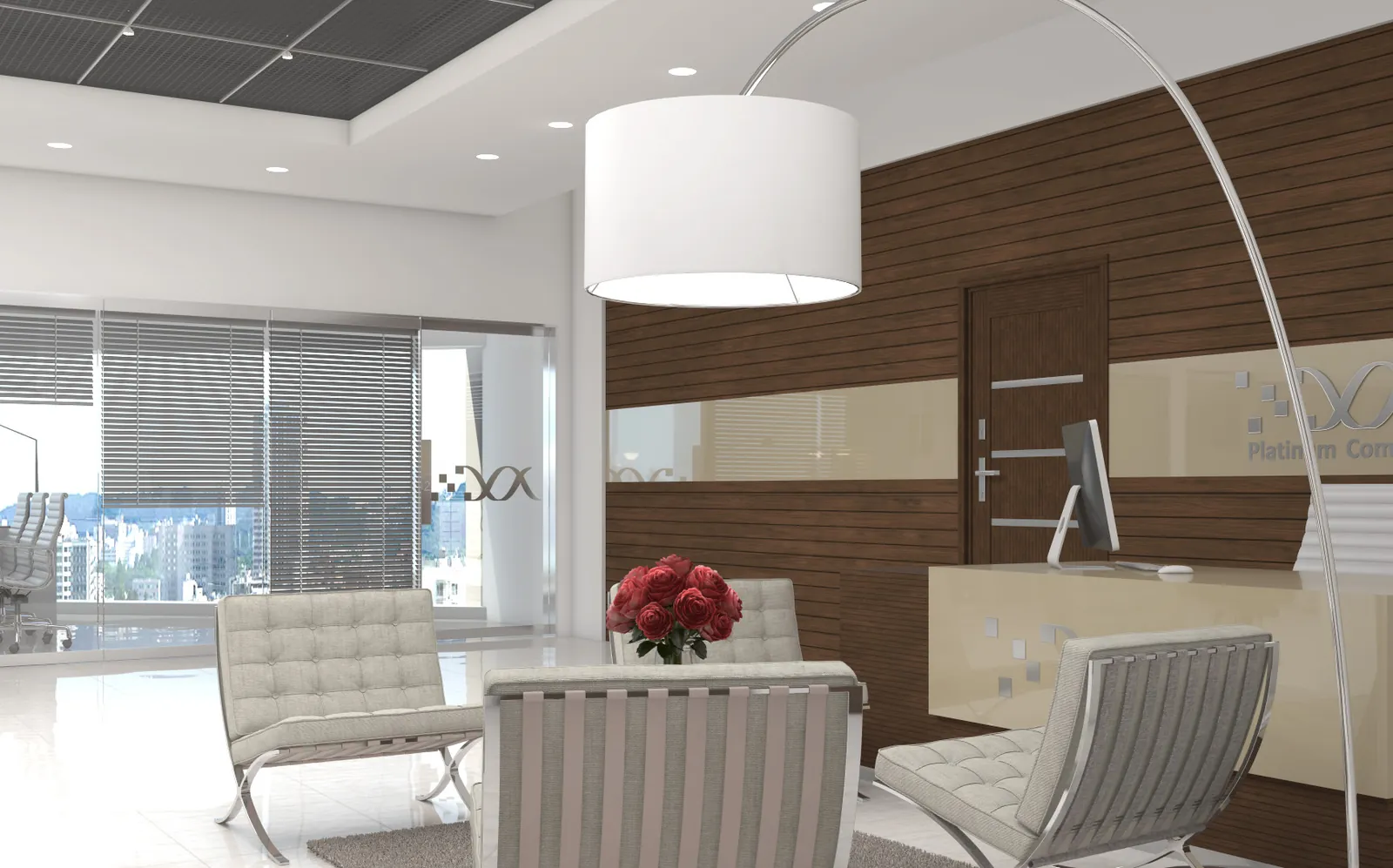
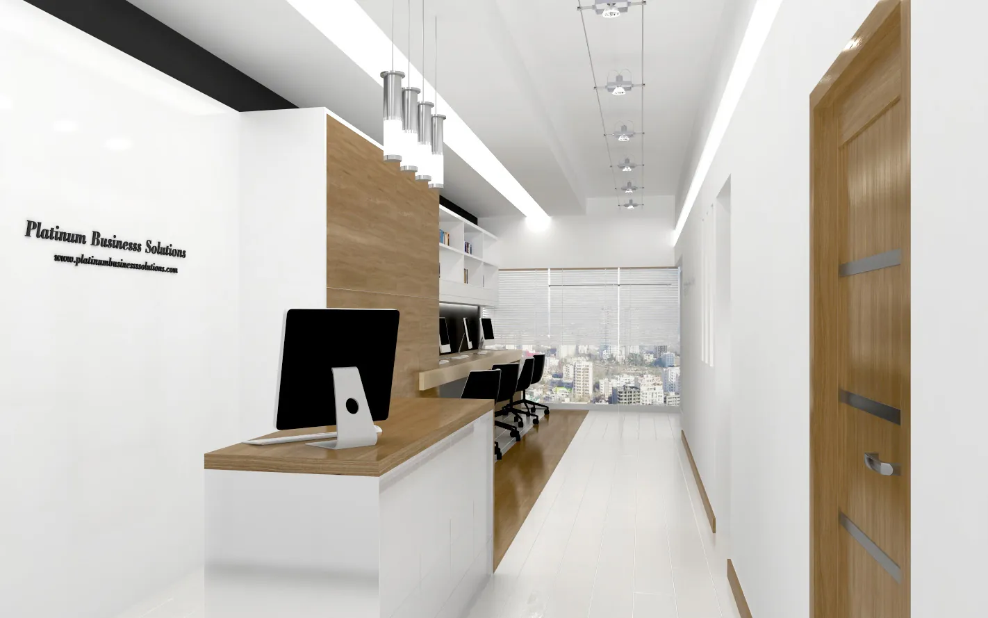
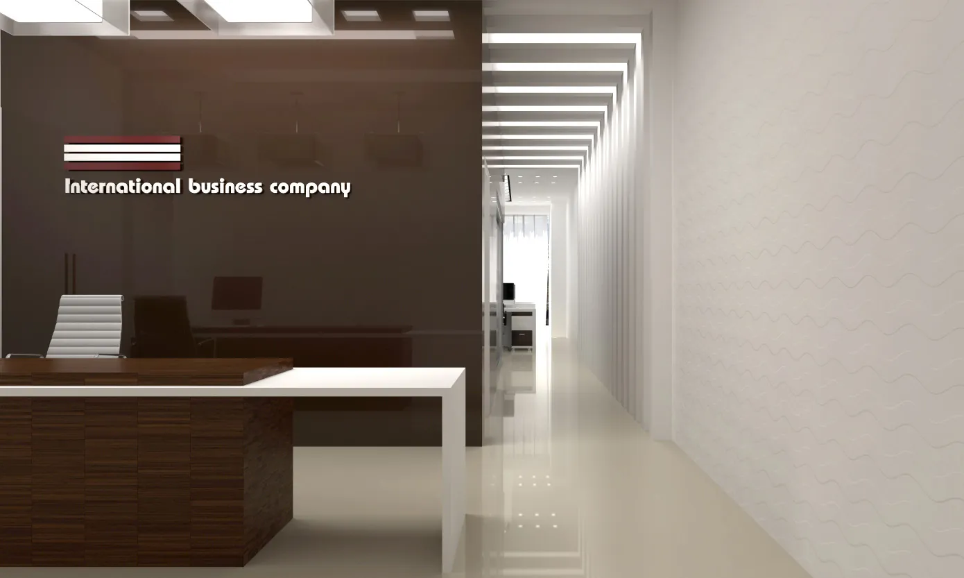
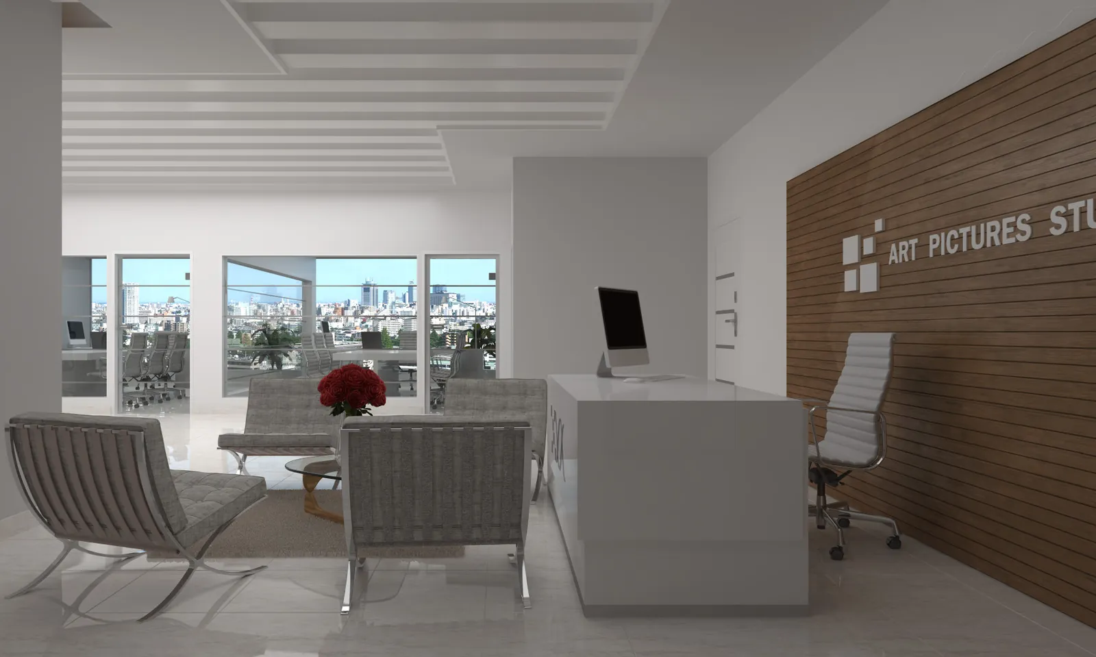
Reception is the first impression a tenant gives its clients, so we studied it carefully. The four examples below show different attitudes to the same task: a lounge-style arrival with armchairs and a warm timber wall, a desk set against a pendant-lit feature wall, and a long reception counter that leads the eye down a corridor of light.
Open-plan offices
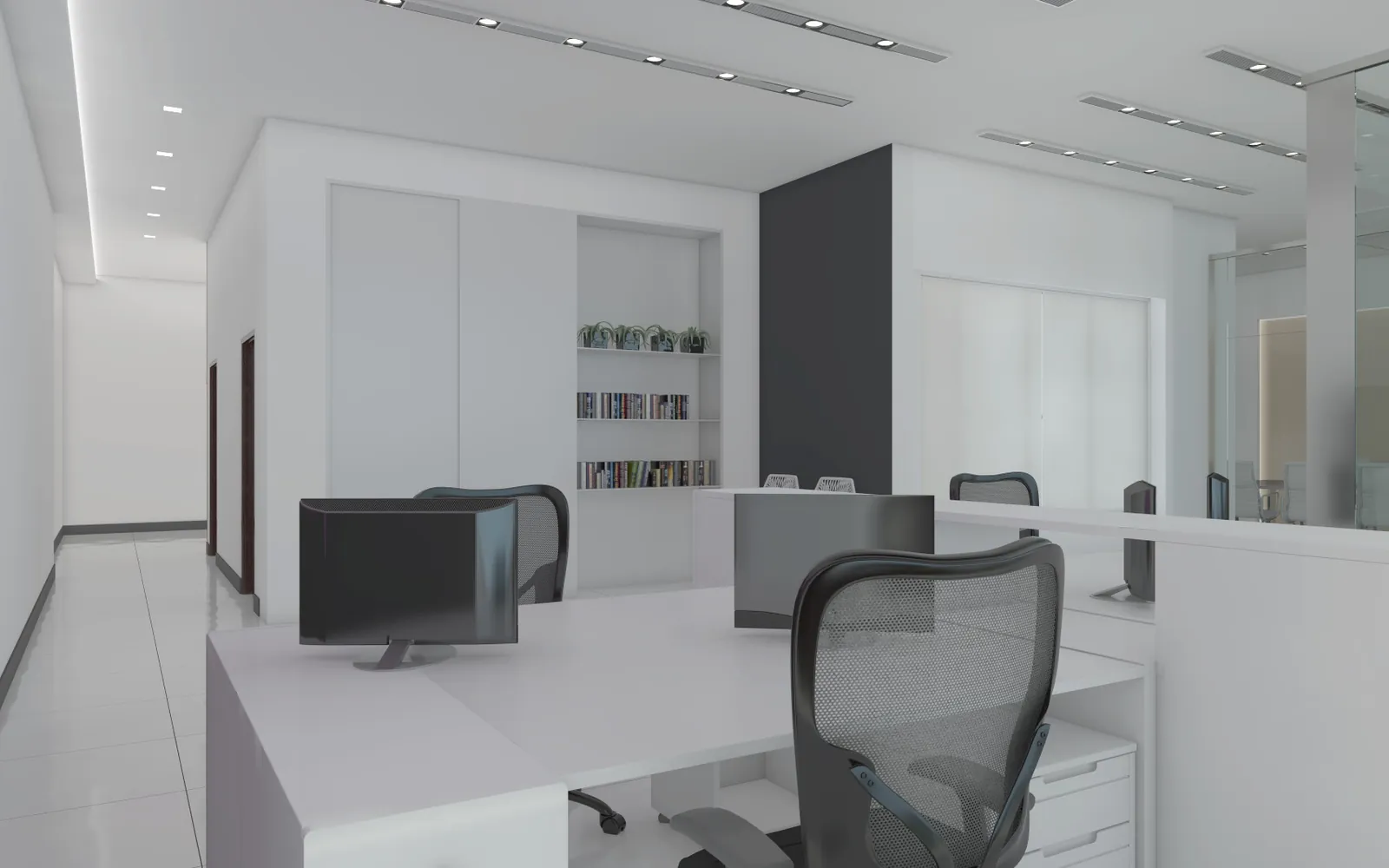
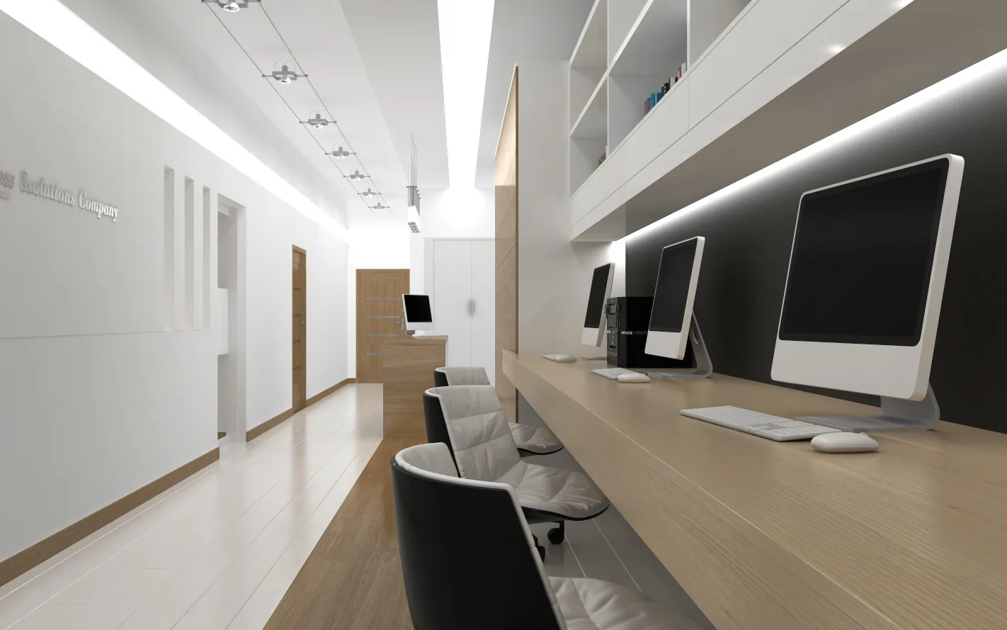
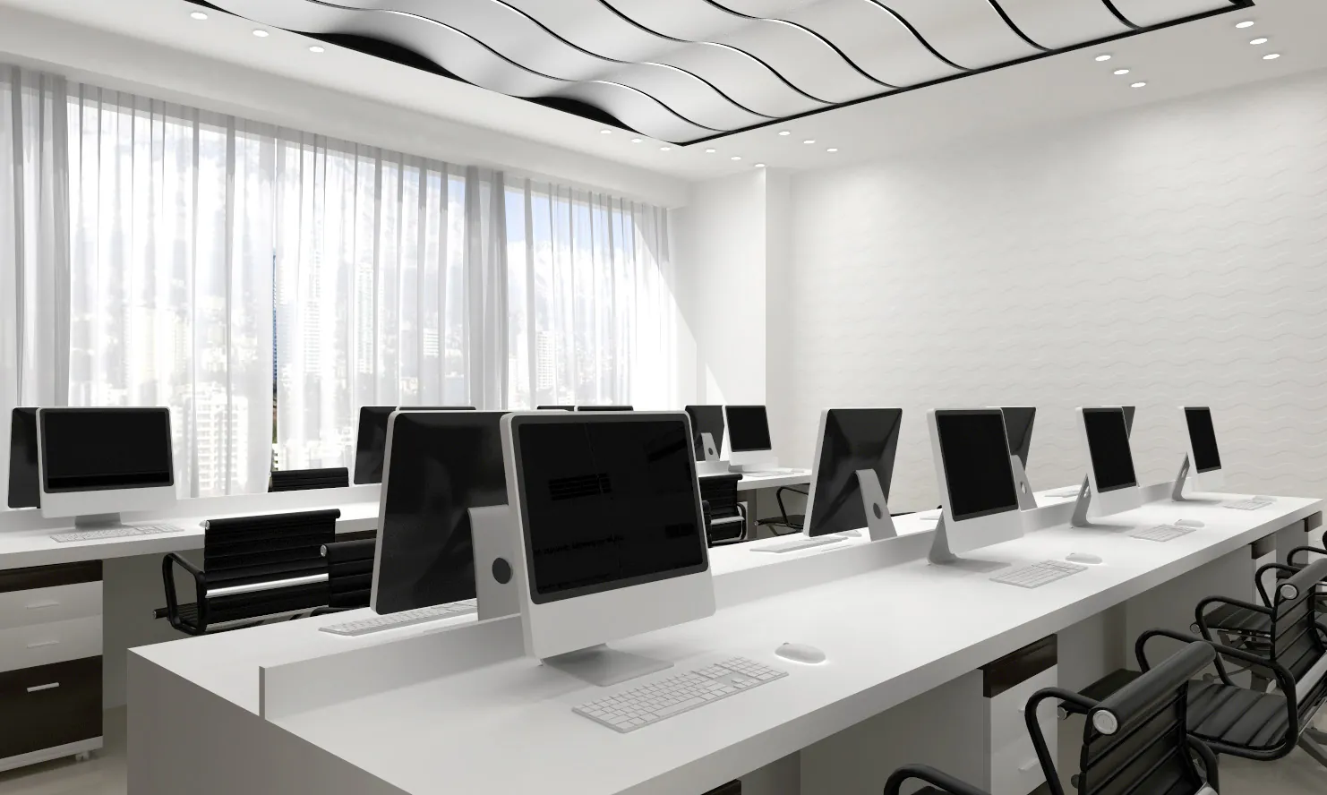
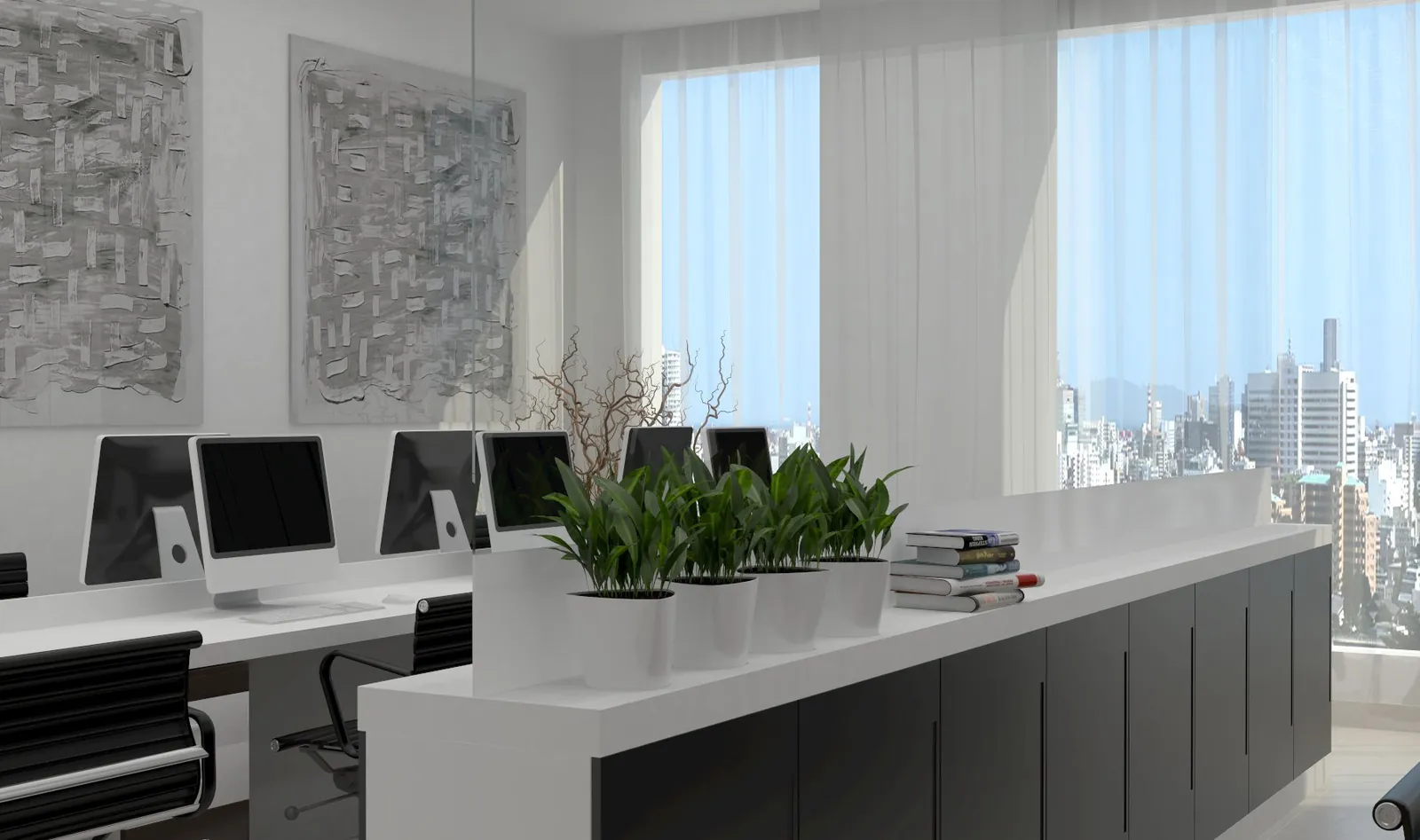
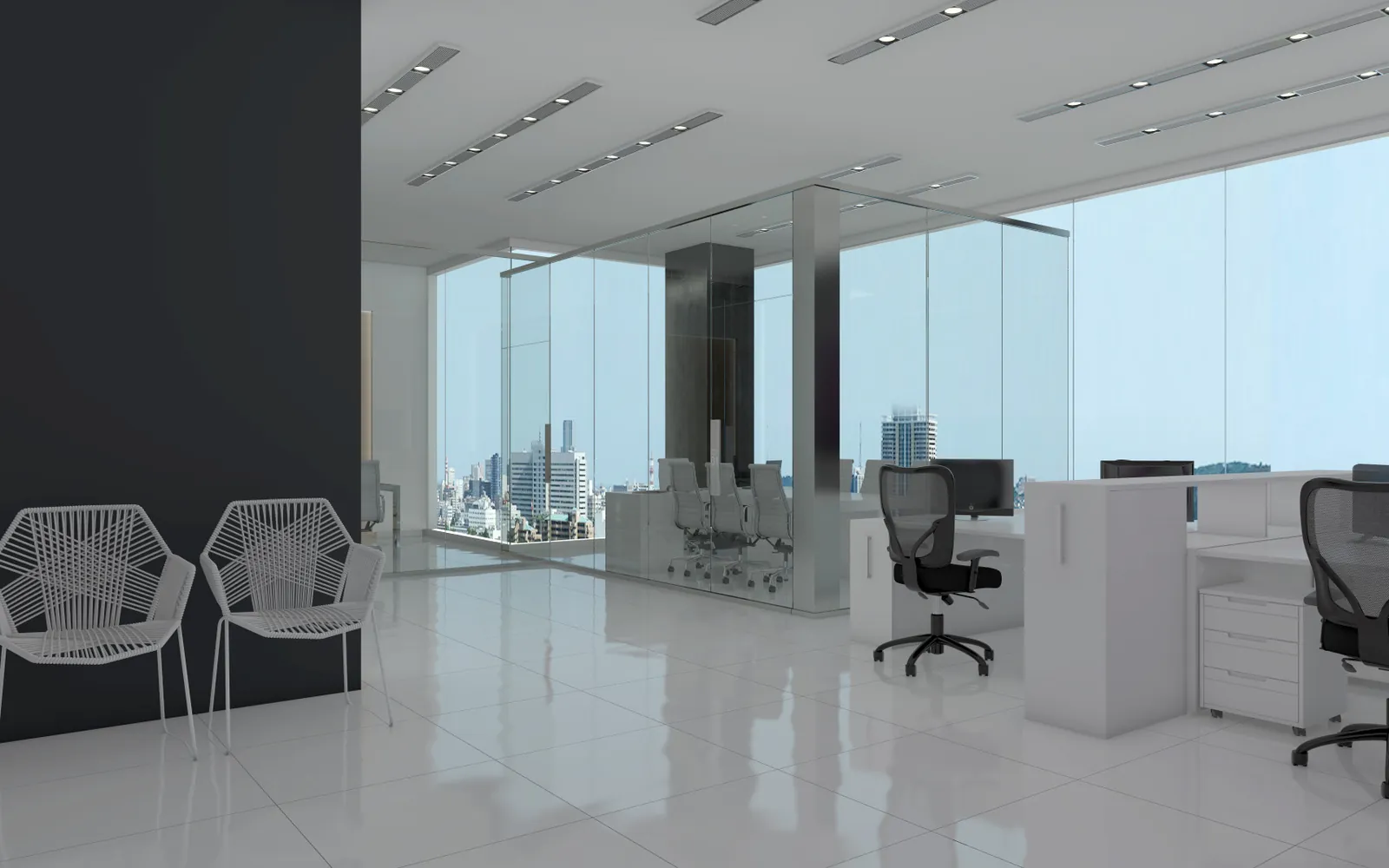
Most of the office floors are planned around open workspaces, and the renders show how desks, storage and circulation can be arranged along the windows. Long white work surfaces, black task chairs and monitors give the rooms a crisp, uniform look, while ceiling details such as light strips and a wave-patterned suspended ceiling keep large floors from feeling flat.
Meeting rooms and glass partitions
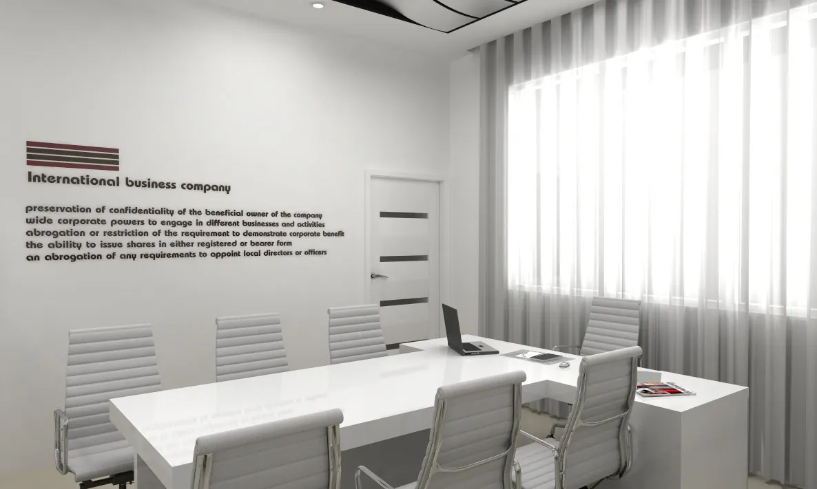
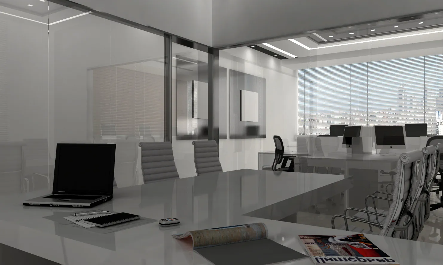
Glass partitions let daylight travel deep into each floor and let managers see their teams without losing acoustic privacy. In the renders, meeting rooms are enclosed in glass or set behind curtained windows, so that the same table can serve a formal board discussion or a small project review.
Shared circulation
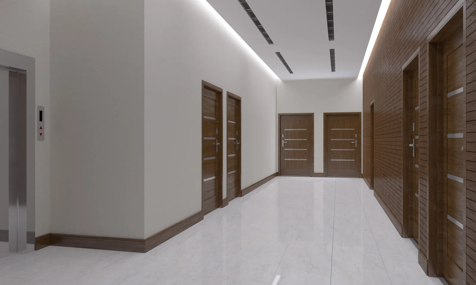
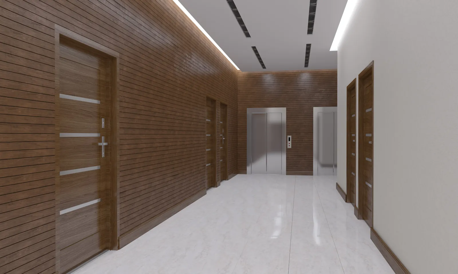
The common corridor links the lifts to the office doors on each floor. We kept it deliberately calm: pale walls, a polished light floor, timber doors and timber wall cladding, and a continuous line of light along the ceiling. Used consistently, the same materials make the circulation feel like part of the same building as the offices behind each door.
A consistent material language
Across the retail frontage, the foyer, the reception areas, the offices and the corridor, a small set of materials returns again and again: white and light-grey surfaces, warm timber, clear glass, brushed metal and linear lighting. That repetition is a deliberate design decision. It gives the building an identity, lets tenants personalise their own spaces without clashing with the whole, and makes the visualization catalogue easier to read as one coherent project.
What this kind of visualization offers
- Early decisions. Tenants and investors can compare layouts, finishes and views before anything is built or fitted out.
- One clear story. A consistent page structure, with plans and camera positions, turns dozens of renders into a navigable catalogue.
- Flexibility. A digital model makes it practical to compare alternative layouts and finishes for a unit before a decision is made.
Starting a similar project
If you are preparing a commercial building, a leasing brochure or a set of office layouts, the most useful starting material is a set of plans and sections, the intended uses, the orientation of each unit and any material or brand preferences. From there we can recommend a scope and a schedule. See our 3D interior rendering, commercial and retail interior design and 3D architectural rendering services, or get in touch to talk through your project.
Keep Reading
1901 Lodge Drive: Interior Design Concept and Material Specs
A room-by-room look at the 1901 Lodge Drive interior design package in Coquitlam, BC: 3D renders, colour palette, finishes, fixtures and furniture specifications.
Hanging Persian Carpets in Moscow: Curved Space Frames, Zoning and Light
How Charisma Design and Karestan designed the Grand Persian Carpet Event in Moscow: curved display stands, three zones and projector lighting for monumental carpets.
Reimagining Heritage: Islamic Geometry Meets Biophilic Design in Muscat
How a mixed-use building in Muscat turns Islamic geometric patterns into a shading facade and wraps a green courtyard of terraces, water and palms.
LET’S DISCUSS YOUR PROJECT
Fill out the form and our manager will contact you for consultation.